

Dashboards, Visualisations, and the Illusion of Control
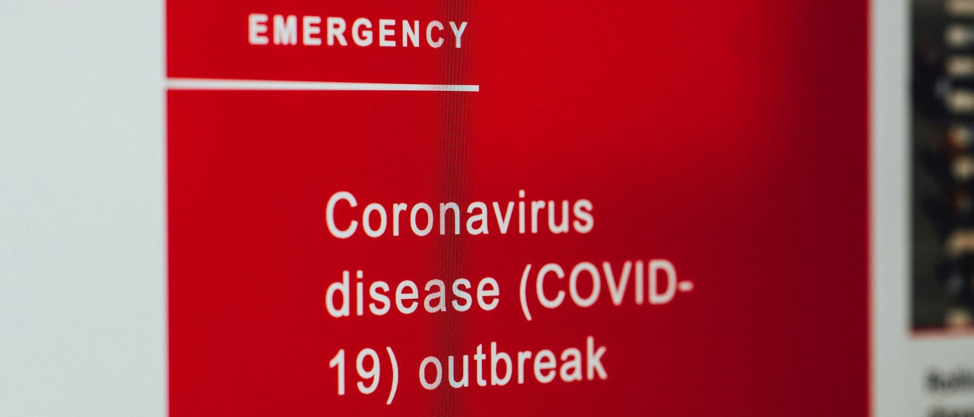
With the US reporting more than 100,000 people infected with COVID-19 as of March 28, it is clear that things are going to get much worse before they get any better. Knowing what we do about the lack of consistent testing and data collection – with symptomatic patients even getting rejected — we know that the picture we have is one that is fragmented at best and simply incorrect at worst. Yet there is a trend that is clearly beginning to establish itself as a result.
Those of us who work in data will likely have seen many dashboards appear in their emails and social media feeds over the last two weeks. Often these have been built in PowerBI or Tableau and are accompanied with uplifting quotes around data playing a part in the fight against the virus. Sandwiched between working from home memes they might seem like a great contribution to increasing situational awareness and providing clarity during this time.

As I wrote in a previous post, there are three questions that need to be answered when it come to data visualisation: what is your goal, is the data worth visualising, and is your message landing? Helping people understand what is happening with coronavirus is a noble effort, no doubt about it. Whether the data is worth visualising, that is another matter. I do not say this because it is not, but because there are already excellent resources out there.
- Johns Hopkins developed an ArcGIS dashboard that gives a clear geographic overview of the spread of the data: Coronavirus COVID-19 Global Cases by the Center for Systems Science and Engineering (CSSE)
- Worldometer provides a tabular overview of the latest coronavirus statistics by severity: Worldometer COVID-19 Coronavirus Pandemic
- Individual countries have developed their own granular dashboards as well, e.g. Hong Kong: Coronavirus Disease (COVID-19) in HK
Therefore, before building a dashboard, the primary question is whether your effort is going to add value beyond those that already exist. Not only would you be wasting your time, but you could be making matters worse. After all, while it is not a comfortable topic to consider, what if you make a mistake in your calculations? What if you do not clearly present the distinction between infections and infections requiring hospitalisation? These are real concerns.
That said, maybe this is not really the point. Management guru Peter Drucker once said that "If you can't measure it, you can't improve it." With many of us feeling rather powerless in the face of this pandemic, perhaps visualising COVID-19 data gives us the illusion of control that we desperately crave. Particularly for those confined to their homes, this might be a good way to stay sane. Take it from someone who has started blogging about coronavirus data.
On a serious note, data is critical to fighting this pandemic. Yet instead of building ever more dashboards featuring the same metrics, let us focus on collecting more data or enriching the current COVID-19 datasets with contextual data. This way you are empowering others in the policy and research community. Of course if you find that visualising Worldometer data is what you need right now for your mental health, then I certainly understand.
– Ryan

Q* Newsletter
Join the newsletter to receive the latest updates in your inbox.

