In Data Visualisation, Be Careful Not to Confuse Style with Substance
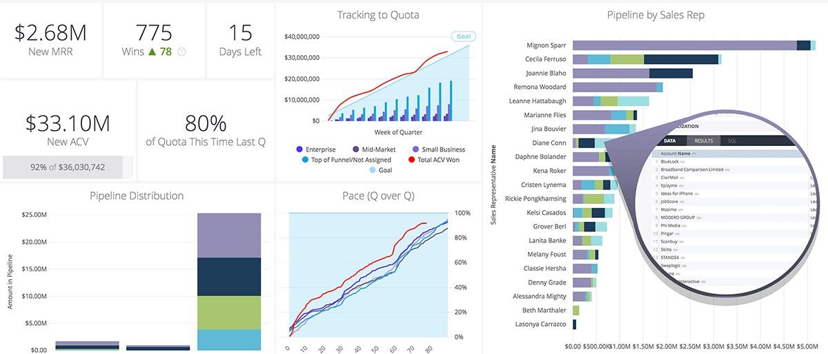
Business intelligence tools and visualisation libraries are better today than ever. Not only is it easier to create data visualisations, but it is easier to create better looking ones too. Thanks to products such as Looker, Tableau, and Qlik, anyone with basic digital skills can now design compelling charts, reports, and dashboards.
That said, it is not just amateurs who are leveraging these tools. There are numerous experts creating captivating visualisations, examples of which can be found on Tableau's Iron Viz competition website or in the Awwwards D3 gallery. However, in an analytics context we need to be careful to keep the goal in mind when designing visualisations to avoid overwrought efforts. We can do this through three questions.

1) What is the purpose of this visualisation? Is it art or is it aimed at helping an audience understand the underlying data? Contrary to how it might come across, I have nothing against data visualisation as an artistic medium. However, I do take issue with people needlessly dropping chord or Sankey diagrams in presentations simply because they think those look cool. Form should follow function.
2) If you are helping an audience understand data, is it worth visualising? There is no doubt that many of the visualisation tools out there are fun to use. However, the danger of this is that it can be tempting to build data visualisations every single time, even if this is not really necessary. Do people really need a beautiful Tableau dashboard if all they needed was a simple table with a few metrics?
3) Is your intended message coming across clearly? In designing a compelling visualisation, it is easy to get carried away and end up with a beautiful dashboard that fails to impart the desired message. In the words of George Bernard Shaw: “The single biggest problem in communication is the illusion that it has taken place.”

Problems arise when these questions are ignored or discounted because people "just want to get on with it." Like building an effective presentation, it is always a good idea to set your goals beforehand. As the first habit of Stephen Covey’s 7 Habits of Highly Effective People reads: “Start with the end in mind.” It saves time down the line.
The increasing availability of not just data but of powerful data visualisation tools is an exciting development, helping to engage a much larger share of the organisation. However, to ensure efforts are not wasted, it is important to ask yourself about the purpose, content, and effectiveness of your work. Tools are a means, not the end.
— Ryan
Q* - Qstar.ai Newsletter
Join the newsletter to receive the latest updates in your inbox.


