

When Familiarity Fails Us
Sunday night, flying back to London from Hong Kong, I read a piece in the New York Times on the development of the Boeing 737 MAX, the model that was involved in the recent Ethiopian Airlines crash. What made this a memorable article was not the disconcerting contrast of reading about aeroplane failures while at 30,000 feet, but a comment by a former Boeing engineer on the expedited development process of the 737 MAX variant:
When upgrading the cockpit with a digital display, he said, his team wanted to redesign the layout of information to give pilots more data that were easier to read. But that might have required new pilot training.
So instead, they simply recreated the decades-old gauges on the screen. “We just went from an analog presentation to a digital presentation,” Mr. Ludtke said. “There was so much opportunity to make big jumps, but the training differences held us back.”
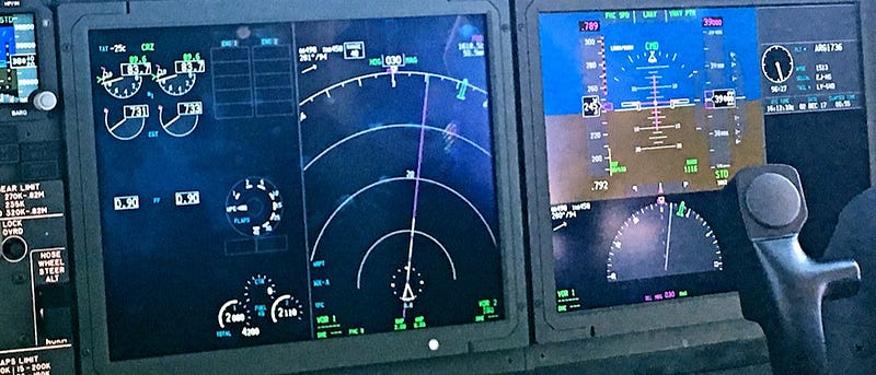
While in both the Ethiopian Airlines and Lion Air crashes the evidence points to a malfunction of the anti-stall Maneuvering Characteristics Augmentation System, the interface choices made for the Boeing 737 MAX are surprising. One major advantage of digital displays is that information can be presented in a much clearer fashion than via analogue devices, with the ability to adapt content and layout to highlight critical information — for example, displaying warning indicators on the screen. In environments where safety is paramount, like hospitals or aeroplanes, having access to dynamic displays is a great boon.
On the other hand, familiar interfaces can ensure that the user has a baseline understanding from the start. In other words, while they might not know how everything works, certain elements will be recognised and these can help the user to assess the device’s associated capabilities. An example is a digital screen with a big red button labelled Alarm. Even without understanding any of the details, you probably know what this button would do. These types of skeuomorphs have popped up in numerous applications for this reason.

So how does this apply to analytics? In order to turn data into insight at scale, organisations needs to introduce new types of visualisations, applications, and processes. Particularly for organisations at the early stages of this journey, it can be tempting to replicate existing Excel templates in Tableau while translating unwieldy offline data sharing processes into digital equivalents. On the other end of the spectrum, companies are pushing the limits of human-computer interaction through augmented reality and voice interfaces.
There is no clear right or wrong answer. What is important is that when new solutions are developed, the interfaces are given thoughtful consideration. In the case of Boeing, engineers’ hands were tied given they had to ensure close similarity between the 737 and 737 MAX in order to limit the training requirement to an hour on an iPad. In most organisations no such restraints exist on development, meaning they are able to both embrace familiarity to increase accessibility, without sacrificing the potential for innovation.
— Ryan

Q* - Qstar.ai Newsletter
Join the newsletter to receive the latest updates in your inbox.

